One of the most pressing issues in modern healthcare isn't just about developing novel AI models; it's about equitable access to the infrastructure required to support basic care. During a recent weekend build sprint, I decided to tackle this problem visually by creating the Healthcare Dearth Map.
The Problem Space
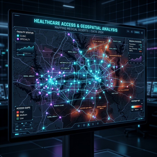
While working with highly complex multimodal datasets out of tier-1 research hospitals, it's easy to forget that broad segments of the population live in "medical deserts." These are regions where access to basic amenities—let alone an advanced MRI or PET scanner—is severely limited. I wanted to build a tool that could instantly overlay geographic data with clinic density, highlighting exactly where these gaps exist.
Technical Implementation
Built primarily with React and mapping libraries, the tool ingests open-source geographic and medical facility coordinate data. By clustering this data dynamically, the application renders a heatmap of access. Areas with high population density but low clinical coverage are flagged.
The challenge was largely in the data standardization. Merging disparate datasets (census tracts vs. medical facility registries) required a clean ETL pipeline to ensure the visualizer could parse the coordinates cleanly and smoothly render them on the client side without locking up the browser.
Why It Matters
Visualizations like this are the first step in driving systemic change. If policy-makers and healthcare executives can literally see the scarcity, conversations around funding and clinic placement shift from abstract statistics to concrete geographic realities.